Lisa Hehnke
Mapping and analyzing road accidents in South Australia
23 Jan 2018
Since I may already have acquired a bit of a reputation for being preoccupied with accident analyses, I decided to give it another shot and map and analyze all (non-)fatal road accidents happening in South Australia in 2016.
Data for this analysis is provided by the South Australian Government Data Directory.
Setup
Running the code below requires the packages ggmap, ggplot2, ggthemes, magrittr, maps, mapdata,
maptools, proj4, raster, rgdal, sp, stringr, and tidyverse.
For loading multiple packages at once, I conventionally use p_load() from the pacman package which is a wrapper function for library() and require() and installs missing packages if necessary.
# Install and load pacman if not already installed
if (!require("pacman")) install.packages("pacman")
library(pacman)

# Load packages
p_load(ggmap, ggplot2, ggthemes, magrittr, maps, mapdata, maptools, proj4, raster, rgdal, sp, stringr, tidyverse)
Downloading and cleaning data
To download the data for the subsequent analysis, either go to the South Australian Government Data Directory’s website and download road-crashes-in-sa-2014-16.zip manually, unzip it and import 2016_DATA_SA_Crash.csv or run this code directly in R:
# Download, unzip and import data on road crashes in 2016
temp <- tempfile()

download.file("https://data.sa.gov.au/data/dataset/21386a53-56a1-4edf-bd0b-61ed15f10acf/resource/446afe5b-4e01-4cdf-a281-edd25aaf3802/download/road-crashes-in-sa-2014-16.zip", temp, mode = "w")

unzip(temp)

accidents <- read_csv("2016_DATA_SA_Crash.csv")

unlink(temp)
After getting the data into R, some minor data cleaning is required.
# Replace blank spaces in column names with underscores and convert letters to lowercase
colnames(accidents) <- gsub(" ", "_", str_trim(tolower(names(accidents))), fixed = TRUE)

# Add column for fatality status of each crash (fatal/non-fatal)
accidents$fatality <- NA # prevents tibble error message
accidents$fatality[accidents$csef_severity == "4: Fatal"] <- "Fatal"
accidents$fatality[accidents$csef_severity != "4: Fatal"] <- "Non-fatal"

# Recode type of crash
accidents$crash_type[accidents$crash_type == "Left Road - Out of Control"] <- "Left Road"
Spatial data wrangling
Prior to finally analyzing the accident data, some more geographical data wrangling needs to be done.
As a first step we need to choose the right projection for transforming the x and y coordinates provided in the data set into their respective longitude and latitude equivalents.
The data itself comes with the following information on the projection (EPSG:3107)
PROJECTION LAMBERT
UNITS METERS
DATUM GDA94 SEVEN /* GDA94 SPHEROID GRS80 PARAMETERS
-28 00 00 /* 1st standard parallel
-36 00 00 /* 2nd standard parallel
135 00 00 /* Central meridian
-32 00 00 /* Latitude of projections origin
1000000 /* False easting (meters)
2000000 /* False northin (meters)
END
which translates into this Proj4 string (thanks to the people over at GIS Stack Exchange for helping me out on this one):
# Projection for accident coordinates (EPSG:3107)
proj <- "+proj=lcc +lat_1=-28 +lat_2=-36 +lat_0=-32 +lon_0=135 +x_0=1000000 +y_0=2000000 +ellps=GRS80 +towgs84=0,0,0,0,0,0,0 +units=m +no_defs"
After setting the right projection/coordinate reference system, we can then transform the accident coordinates to spatial points using project() from the proj4 package.
# Code spatial points and convert to data frame
points <- proj4::project(accidents[, c("accloc_x", "accloc_y")], proj = proj, inverse = TRUE)

accidents$longitude <- points$x
accidents$latitude <- points$y

names(accidents)[names(accidents) == "longitude"] <- "long"
names(accidents)[names(accidents) == "latitude"] <- "lat"

accidents_df <- as.data.frame(accidents)
In order to map the spatial points we need matching Australian shapefiles (.shp; a geospatial vector data format for GIS software), which luckily can be found at the South Australian Government Data Directory’s website as well and consist of both country outlines and state borders.
To obtain the shapefiles, download nsaasr9nnd_02211a04es_geo___.zip, unzip it and load aust_cd66states.shp into R or, again, use the automated code provided below:
# Download, unzip and import Australian shapefiles

temp <- tempfile()

download.file("http://data.daff.gov.au/data/warehouse/nsaasr9nnd_022/nsaasr9nnd_02211a04es_geo___.zip", temp, mode = "w")

unzip(temp)

aus_shp <- readShapeSpatial("aust_cd66states.shp", proj4string = CRS("+proj=longlat +ellps=WGS84"))

unlink(temp)
For creating a tailor-made map depicting road accidents in South Australia only, we need to subset the state polygon from the spatial SpatialPolygonsDataFrame object aus_shp (STE denotes state).
# Subset South Australia
sa_shp <- subset(aus_shp, STE == 4)
Mapping road crashes
While ggplot2 maps are nice in themselves, inspired by this post, we attempt to make them even nicer by modifying the basic theme in theme_map() as follows
# Set theme for maps
map_theme <- theme_map(base_family = "Avenir") +
  theme(strip.background = element_blank(),
        strip.text = element_text(size = rel(1), face = "bold"),
        text = element_text(size = 10),
        plot.caption = element_text(colour = "grey50"))
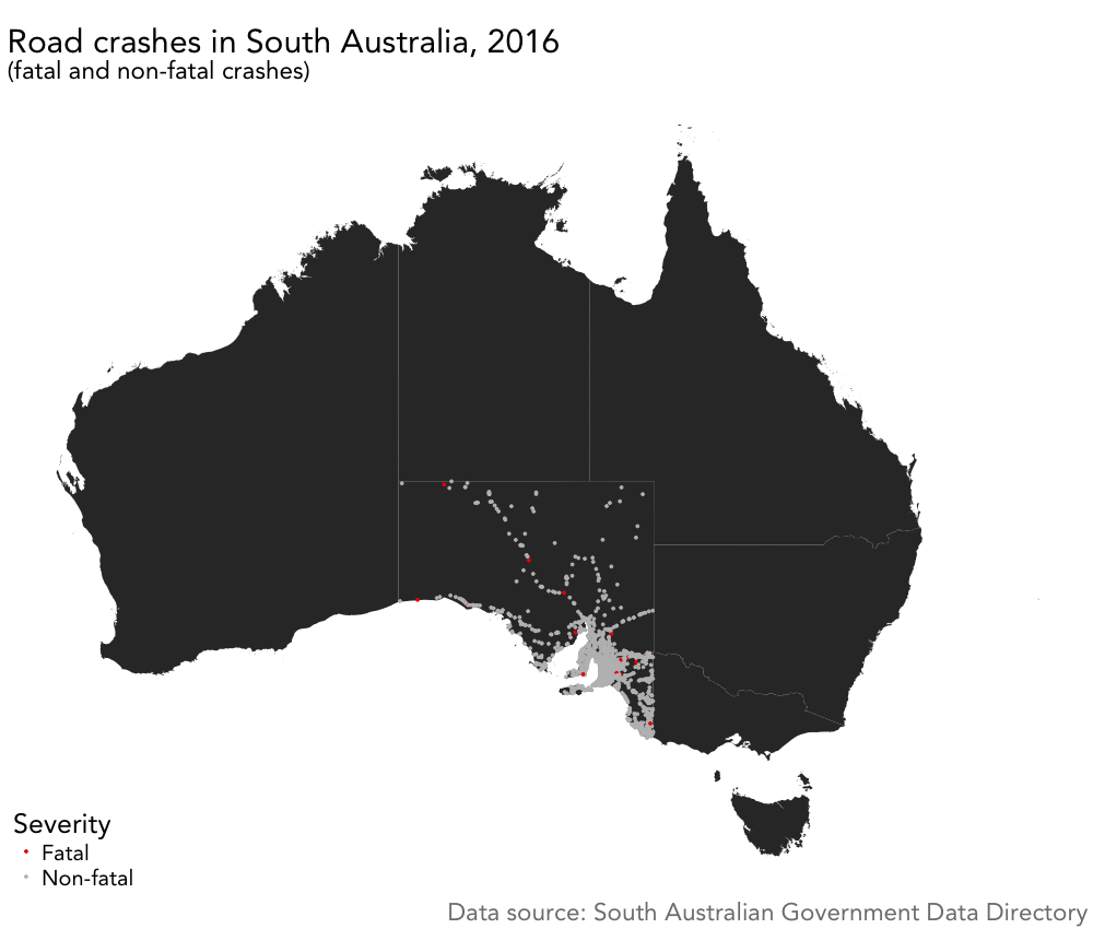
and plot the first map showing all fatal and non-fatal road crashes in South Australia in 2016. (Note that several points lie outside the polygon.)
# Plot road accidents
ggplot() +
  geom_polygon(data = aus_shp, aes(x = long, y = lat, group = group)) +
  geom_point(data = accidents_df, aes(x = long, y = lat, colour = fatality), size = 1) +
  labs(x = "", y = "", title = "Road crashes in South Australia, 2016", subtitle = "(fatal and non-fatal crashes),
       caption = "Data source: South Australian Government Data Directory"") + map_theme +
  scale_color_manual(name = "Severity", values = c("Fatal" = "red2", "Non-fatal" = "grey")) +
  coord_equal()
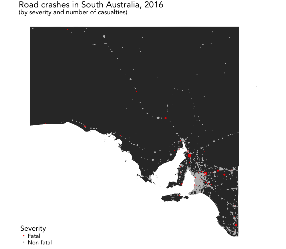
Since the accident data at hand only covers crashes in one particular state, we use the subsetted sa_shp polygon to restrict the map to the South Australian area
# Plot road accidents with point sizes adjusted by number of casualties
ggplot() +
  geom_polygon(data = sa_shp, aes(x = long, y = lat, group = group)) +
  geom_point(data = accidents_df, aes(x = long, y = lat, colour = fatality, size = total_cas/1.5)) +
  labs(x = "", y = "", title = "Road crashes in South Australia, 2016", subtitle = "(by severity and number of casualties)") + map_theme +
  scale_color_manual(name = "Severity", values = c("Fatal" = "red2", "Non-fatal" = "grey")) +
  scale_size_identity() + coord_equal()
which yields the following map, where the point sizes reflect the total number of casualties (divided by 1.5 for aesthetic reasons):
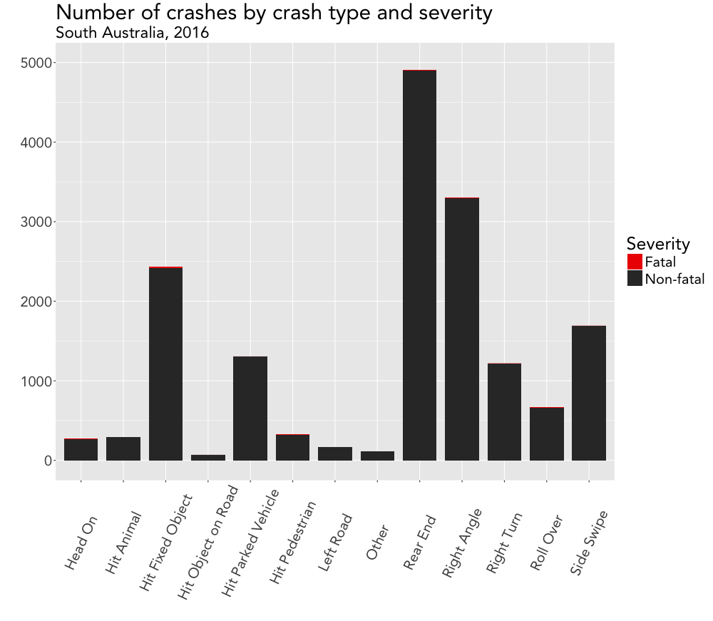
Visualizing crashes by type
After having mapped all road crashes, we can further analyze the data by visualizing some basic statistics.
As before, we customize the theme of the ggplot2 map using theme() to somewhat match the layout of the map we previously built
# Set theme for visualizations
viz_theme <- theme(
  strip.background = element_blank(),
  strip.text = element_text(size = rel(1), face = "bold"),
  plot.caption = element_text(colour = "grey50"),
  axis.text.x = element_text(angle = 65, vjust = 0.5),
  text = element_text(family = "Avenir"))
and make a nice looking graph of the total number of crashes by crash type and severity of crash (fatal/non-fatal) by running
# Plot number of crashes by crash type and severity
ggplot(accidents_df, aes(crash_type)) +
  geom_bar(aes(fill = fatality), width = 0.8) +
  labs(x = "", y = "", title = "Number of crashes by crash type and severity", subtitle = "South Australia, 2016") +
  scale_fill_manual(name = "Severity", values = c("Fatal" = "red2", "Non-fatal" = "grey35")) +
  viz_theme + ylim(0, 5000) # + theme(legend.position = "bottom")
and thus creating this plot:
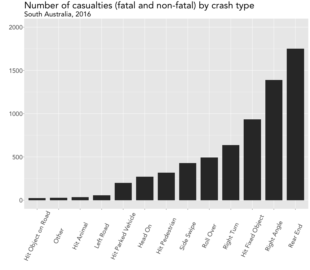
Visualizing casualties by crash type
In a similar manner, we can make another bar chart for the number of casualties by crash type. Prior to plotting, however, we need to calculate the corresponding numbers first.
As a bonus feature we now rearrange the bars of the plot by ordering the crash types by number of casualties in ascending order.
# Calculate total number of casualties by crash type
accidents_cas <- accidents_df[, c("crash_type", "total_cas")]

accidents_cas %<>%
  group_by(crash_type) %>%
  summarise(cas_sum = sum(total_cas))
names(accidents_cas) <- c("crash_type", "total_cas")

# Order crash types by number of casualties
accidents_cas_ordered <- accidents_cas %>%
  arrange(total_cas, crash_type) %>%
  mutate(crash_type = factor(crash_type, unique(crash_type)))

# Plot number of casualties by crash type (ordered)
ggplot(accidents_cas_ordered, aes(crash_type, total_cas)) +
  geom_bar(stat = "identity", width = 0.8, color = "red", fill = "black") +
  labs(x = "", y = "", title = "Number of casualties (fatal and non-fatal) by crash type", subtitle = "South Australia, 2016") +
  viz_theme + ylim(0, 2000)
These three chunks of code then produce the following plot:
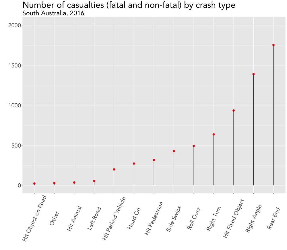
Bonus: Visualizing casualties via lollipop chart
While browsing this site, I found both inspiration and sample codes for making some #dataviz magic happen.
As a result, I decided to finish up this post by complementing the previous chart with its more modern looking lollipop counterpart.
# Lollipop chart of number of casualties by crash type
ggplot(accidents_cas, aes(x = crash_type, y = total_cas)) +
  geom_point(size = 3, color = "red", fill = "grey35") +
  geom_segment(aes(x = crash_type,
                   xend = crash_type,
                   y = 0,
                   yend = total_cas)) +
  labs(x = "", y = "", title = "Number of casualties (fatal and non-fatal) by crash type", subtitle = "South Australia, 2016") +
  viz_theme + ylim(0, 2000)
Note: The above code is only a (slightly adapted) snippet of the full script, which can be found here.