Lisa Hehnke
Flights at Night: Mapping airline routes on NASA's night lights images
27 Jan 2018
Admittedly, mapping airline routes using flight data is neither a bold move nor that innovative. FlowingData did it, R-Bloggers did it, Spatial.ly did it (and even wrote about someone else who did it).
Yet, as an aviation enthusiast I couldn’t resist laying my hands on this kind of data, especially after stumbling across Weimin Wang’s call for more visualizations featuring some sort of lighting effect. While Weimin used urban data to achieve this effect, I will draw on night lights images provided by the NASA Earth Observatory.
Despite me being the nth person working with flight data, most of the previous approaches don’t seem to start from scratch, i.e., by downloading raw data straight from the internet and processing it prior to mapping. Hence, the code below covers both these initial steps and demonstrates how to create nice looking maps like this one

using OpenFlights data in combination with NASA images.
Given the bulk of tutorials on flight data, the blog post itself contains rather technical instructions. For more detailed explanations on the prerequisites and foundations of spatial mapping using R see the aforementioned links.
Setup
In order to visualize flight routes using this tutorial, you’ll need the packages data.table, geosphere, ggplot2, grid, maps, jpeg, plyr, and tidyverse.
As usual, I used p_load() from the pacman package to load multiple libraries in one line of code.
# Install and load pacman if not already installed
if (!require("pacman")) install.packages("pacman")
library(pacman)

# Load packages
p_load(data.table, geosphere, ggplot2, grid, jpeg, plyr, tidyverse)
Downloading and importing data
To download and import the required data from OpenFlights.org, simply run the following code in R:
# Download OpenFlights data
download.file("https://raw.githubusercontent.com/jpatokal/openflights/master/data/airlines.dat",
destfile = "airlines.dat", mode = "wb")
download.file("https://raw.githubusercontent.com/jpatokal/openflights/master/data/airports.dat",
destfile = "airports.dat", mode = "wb")
download.file("https://raw.githubusercontent.com/jpatokal/openflights/master/data/routes.dat",
destfile = "routes.dat", mode = "wb")

# Import data
airlines <- fread("airlines.dat", sep = ",", skip = 1)
airports <- fread("airports.dat", sep = ",")
routes <- fread("routes.dat", sep = ",")
After obtaining the raw data, some wrangling on the non-spatial part of the data needs to be done first.
# Add column names
colnames(airlines) <- c("airline_id", "name", "alias", "iata", "icao", "callsign", "country", "active")
colnames(airports) <- c("airport_id", "name", "city", "country", "iata", "icao", "latitude", "longitude",
"altitude", "timezone", "dst", "tz_database_time_zone", "type", "source")
colnames(routes) <- c("airline", "airline_id", "source_airport", "source_airport_id", "destination_airport",
"destination_airport_id", "codeshare", "stops", "equipment")

# Convert character to numeric
routes$airline_id <- as.numeric(routes$airline_id)

# Merge airline data with data on routes
flights <- left_join(routes, airlines, by = "airline_id")

# Merge data on flights with information on airports
airports_orig <- airports[, c(5, 7, 8)]
colnames(airports_orig) <- c("source_airport", "source_airport_lat", "source_airport_long")

airports_dest <- airports[, c(5, 7, 8)]
colnames(airports_dest) <- c("destination_airport", "destination_airport_lat", "destination_airport_long")

flights <- left_join(flights, airports_orig, by = "source_airport")
flights <- left_join(flights, airports_dest, by = "destination_airport")

# Remove observations with missing values
flights <- na.omit(flights, cols = c("source_airport_long", "source_airport_lat", "destination_airport_long", "destination_airport_lat"))
Spatial data wrangling
Concerning the spatial part of the data wrangling process, the aim here is to visualize geographic connections (i.e., flights) between spatial points (i.e., airports) by drawing creat circle lines between them, which can be done by using the gcIntermediate() function from the geosphere package (click here for a more detailed tutorial on this topic).
# Split the data into separate data sets
flights_split <- split(flights, flights$name)

# Calculate intermediate points between each two locations
flights_all <- lapply(flights_split, function(x) gcIntermediate(x[, c("source_airport_long", "source_airport_lat")],
x[, c("destination_airport_long", "destination_airport_lat")],
100, breakAtDateLine = FALSE, addStartEnd = TRUE, sp = TRUE))

# Turn data into a data frame for mapping with ggplot2
flights_fortified <- lapply(flights_all, function(x) ldply(x@lines, fortify))

# Unsplit lists
flights_fortified <- do.call("rbind", flights_fortified)

# Add and clean column with airline names
flights_fortified$name <- rownames(flights_fortified)
flights_fortified$name <- gsub("\\..*", "", flights_fortified$name)

# Extract first and last observations for plotting source and destination points (i.e., airports)
flights_points <- flights_fortified %>%
  group_by(group) %>%
  filter(row_number() == 1 | row_number() == n())
Processing NASA’s night lights image
As mentioned at the beginning, all maps in this blog post use NASA’s so-called night lights images – satellite images of the Earth at night – as raster objects (image credit: NASA Earth Observatory).
You can import .jpg files to R with the readJPEG()function from the jpeg package and render them with rasterGrob() from the grid graphics package. Alternatively, you can use GeoTIFF files for a higher resolution and, if available, additional geospatial metadata.
# Download NASA night lights image
download.file("https://www.nasa.gov/specials/blackmarble/2016/globalmaps/BlackMarble_2016_01deg.jpg",
destfile = "BlackMarble_2016_01deg.jpg", mode = "wb")

# Load picture and render
earth <- readJPEG("BlackMarble_2016_01deg.jpg", native = TRUE)
earth <- rasterGrob(earth, interpolate = TRUE)
Mapping airline routes on night lights
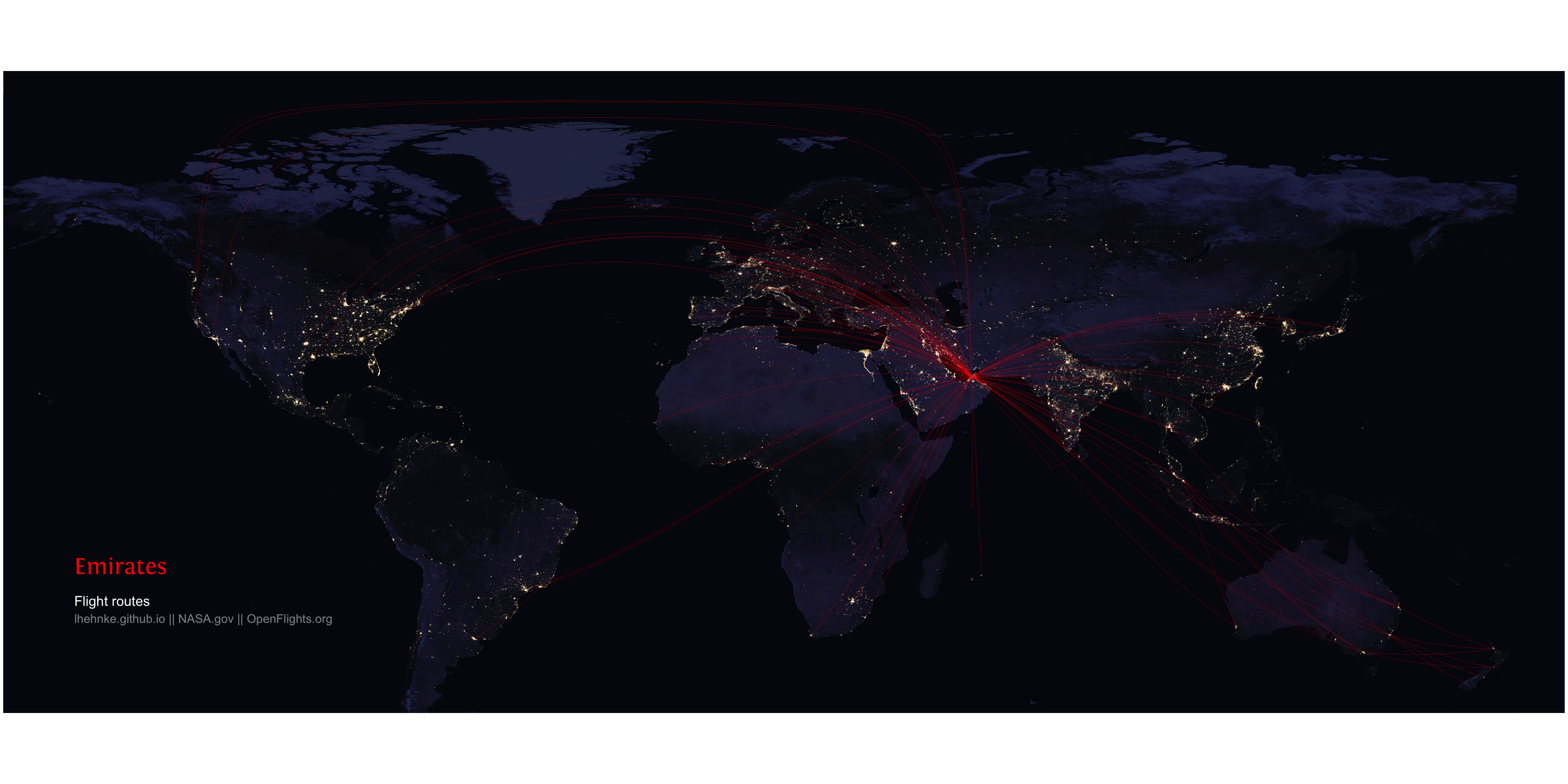
While editing the code for the final maps, I wanted to step up my #dataviz game and try to mimic the airlines’ logos by customizing both text colors and fonts. The airlines below were chosen for no particular reason other than being my favourite airline (Lufthansa) or having nicely constructed flight routes and visually appealing corporate colors that make for some great lighting effects (Emirates; British Airways).
After conducting a quick Google search, I decided on the following parameters, which come quite close to the original logos:
- Lufthansa:
Helvetica black;#f9ba00 - Emirates:
Fontin;#ff0000 - British Airways:
Baker Signet Std;#075aaa
In R, using fonts other than the basic PostScript fonts can be done by importing them with the extrafont package.
#install.packages("extrafont")
#library(extrafont)
#font_import()
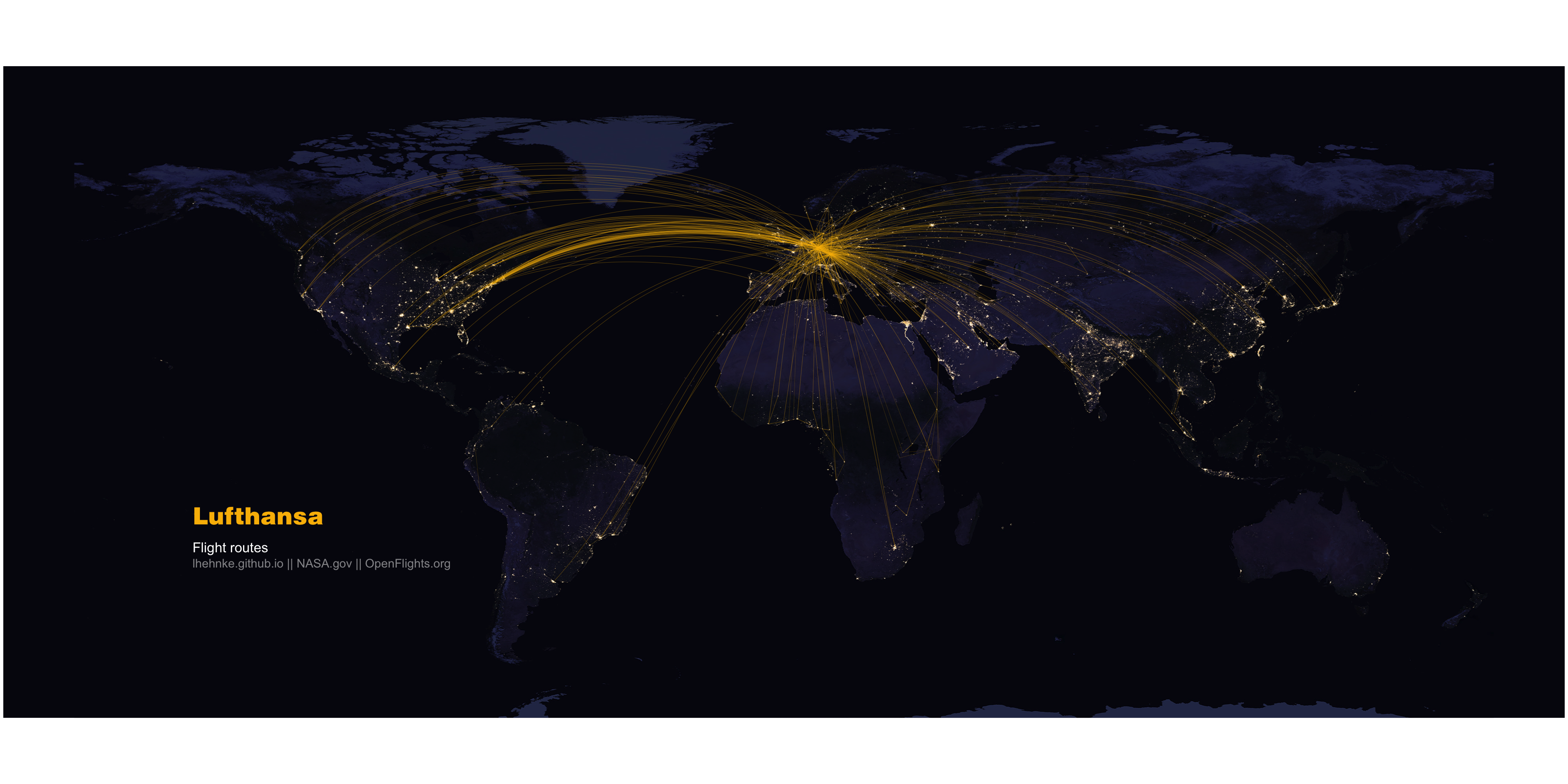
1. Lufthansa
After importing NASA’s night lights image and (optionally) adjusting the text parameters, you can now build a map of the airlines’ routes by stacking the single layers of the map, modifying its default theme and annotating it as follows
ggplot() +
  annotation_custom(earth, xmin = -180, xmax = 180, ymin = -90, ymax = 90) +
  geom_path(aes(long, lat, group = id, color = name), alpha = 0.0, size = 0.0, data = flights_fortified) +
  geom_path(aes(long, lat, group = id, color = name), alpha = 0.2, size = 0.3, color = "#f9ba00", data = flights_fortified[flights_fortified$name == "Lufthansa", ]) +
  geom_point(data = flights_points[flights_points$name == "Lufthansa", ], aes(long, lat), alpha = 0.8, size = 0.1, colour = "white") +
  theme(panel.background = element_rect(fill = "#05050f", colour = "#05050f"),
        panel.grid.major = element_blank(),
        panel.grid.minor = element_blank(),
        axis.title = element_blank(),
        axis.text = element_blank(),
        axis.ticks.length = unit(0, "cm"),
        legend.position = "none") +
  annotate("text", x = -150, y = -18, hjust = 0, size = 14,
           label = paste("Lufthansa"), color = "#f9ba00", family = "Helvetica Black") +
  annotate("text", x = -150, y = -26, hjust = 0, size = 8,
           label = paste("Flight routes"), color = "white") +
  annotate("text", x = -150, y = -30, hjust = 0, size = 7,
           label = paste("lhehnke.github.io || NASA.gov || OpenFlights.org"), color = "white", alpha = 0.5) +
  coord_equal()

ggsave("Lufthansa.png", width = 36, height = 18, units = "in", dpi = 100)
which results in this beautiful map:
The next two maps can be created in almost the same manner by simply changing the name of the airline in flights_fortified[flights_fortified$name == "AIRLINE NAME", ] and flights_points[flights_points$name == "AIRLINE NAME", ] when subsetting the data to whichever airline’s routes you’d like to plot.
2. Emirates
ggplot() +
  annotation_custom(earth, xmin = -180, xmax = 180, ymin = -90, ymax = 90) +
  geom_path(aes(long, lat, group = id, color = name), alpha = 0.0, size = 0.0, data = flights_subset) +
  geom_path(aes(long, lat, group = id, color = name), alpha = 0.2, size = 0.3, color = "#ff0000", data = flights_fortified[flights_fortified$name == "Emirates", ]) +
  geom_point(data = flights_points[flights_points$name == "Emirates", ], aes(long, lat), alpha = 0.8, size = 0.1, colour = "white") +
  theme(panel.background = element_rect(fill = "#05050f", colour = "#05050f"),
        panel.grid.major = element_blank(),
        panel.grid.minor = element_blank(),
        axis.title = element_blank(),
        axis.text = element_blank(),
        axis.ticks.length = unit(0, "cm"),
        legend.position = "none") +
  annotate("text", x = -150, y = -18, hjust = 0, size = 14,
           label = paste("Emirates"), color = "#ff0000", family = "Fontin") +
  annotate("text", x = -150, y = -26, hjust = 0, size = 8,
           label = paste("Flight routes"), color = "white") +
  annotate("text", x = -150, y = -30, hjust = 0, size = 7,
           label = paste("lhehnke.github.io || NASA.gov || OpenFlights.org"), color = "white", alpha = 0.5) +
  coord_equal()

ggsave("Emirates.png", width = 36, height = 18, units = "in", dpi = 100)
3. British Airways
ggplot() +
  annotation_custom(earth, xmin = -180, xmax = 180, ymin = -90, ymax = 90) +
  geom_path(aes(long, lat, group = id, color = name), alpha = 0.0, size = 0.0, data = flights_subset) +
  geom_path(aes(long, lat, group = id, color = name), alpha = 0.2, size = 0.3, color = "#075aaa", data = flights_fortified[flights_fortified$name == "British Airways", ]) +
  geom_point(data = flights_points[flights_points$name == "British Airways", ], aes(long, lat), alpha = 0.8, size = 0.1, colour = "white") +
  theme(panel.background = element_rect(fill = "#05050f", colour = "#05050f"),
        panel.grid.major = element_blank(),
        panel.grid.minor = element_blank(),
        axis.title = element_blank(),
        axis.text = element_blank(),
        axis.ticks.length = unit(0, "cm"),
        legend.position = "none") +
  annotate("text", x = -150, y = -18, hjust = 0, size = 14,
           label = paste("BRITISH AIRWAYS"), color = "#075aaa", family = "Baker Signet Std") +
  annotate("text", x = -150, y = -26, hjust = 0, size = 8,
           label = paste("Flight routes"), color = "white") +
  annotate("text", x = -150, y = -30, hjust = 0, size = 7,
           label = paste("lhehnke.github.io || NASA.gov || OpenFlights.org"), color = "white", alpha = 0.5) +
  coord_equal()

ggsave("BritishAirways.png", width = 36, height = 18, units = "in", dpi = 100)

Mapping multiple airlines’ flight routes
To simultaneously map routes for two or more airlines, you can create a list containing the respective airline names and subset the flights_fortified object which was created during the spatial data wrangling part of this post by indexing it with the %in% operator.
Before mapping the routes, you have to filter the corresponding source and destination points from the subset and after doing so you’re ready to plot.
# Subset multiple airlines
## Note: Change this code snippet if you're more interested in mapping other airline routes.
flights_subset <- c("Lufthansa", "Emirates", "British Airways")
flights_subset <- flights_fortified[flights_fortified$name %in% flights_subset, ]

flights_points_subset <- flights_subset %>%
  group_by(group) %>%
  filter(row_number() == 1 | row_number() == n())

# Plot
ggplot() +
  annotation_custom(earth, xmin = -180, xmax = 180, ymin = -90, ymax = 90) +
  geom_path(aes(long, lat, group = id, color = name), alpha = 0.2, size = 0.3, data = flights_subset) +
  geom_point(data = flights_points_subset, aes(long, lat), alpha = 0.8, size = 0.1, colour = "white") +
  scale_color_manual(values = c("#f9ba00", "#ff0000", "#075aaa")) +
  theme(panel.background = element_rect(fill = "#05050f", colour = "#05050f"),
        panel.grid.major = element_blank(),
        panel.grid.minor = element_blank(),
        axis.title = element_blank(),
        axis.text = element_blank(),
        axis.ticks.length = unit(0, "cm"),
        legend.position = "none") +
  annotate("text", x = -150, y = -4, hjust = 0, size = 14,
           label = paste("Lufthansa"), color = "#f9ba00", family = "Helvetica Black") +
  annotate("text", x = -150, y = -11, hjust = 0, size = 14,
           label = paste("Emirates"), color = "#ff0000", family = "Fontin") +
  annotate("text", x = -150, y = -18, hjust = 0, size = 14,
           label = paste("BRITISH AIRWAYS"), color = "#075aaa", family = "Baker Signet Std") +
  annotate("text", x = -150, y = -30, hjust = 0, size = 8,
           label = paste("Flight routes"), color = "white") +
  annotate("text", x = -150, y = -34, hjust = 0, size = 7,
           label = paste("lhehnke.github.io || NASA.gov || OpenFlights.org"), color = "white", alpha = 0.5) +
  coord_equal()

ggsave("Airlines.png", width = 36, height = 18, units = "in", dpi = 100)
This last chunk of code will finally get you the map shown right at the beginning:
And to end this post in the style of a famous American TV host and travel author:
“Keep on mappin’! Ciao.”