Lisa Hehnke
Scraping and visualizing historical data on executions in the US
08 Feb 2018
As of lately, both web scraping and criminology really caught my interest and I’ve been planning on exploiting the synergy effects of the two topics for quite a while now. To make a long story short, this initial idea has now resulted in a rather extensive data set on executions in the United States during the 19th century, containing biographical and juridical information on executed criminals (N = 5455). You can access and download the data set here.
This blog post covers scraping the raw data from its source, processing it, and creating some choropleth maps and basic visualizations using tmap and ggplot2.
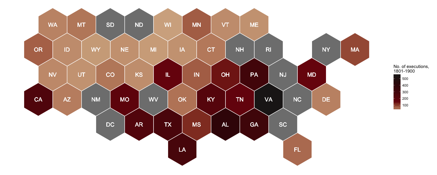
In addition to the standard choropleth map, I gave Joseph Bailey’s geogrid package for turning spatial polygons into hexagonal grids a try, yielding this fancy-looking map of the total number of executions in the US from 1801 to 1900:
And if you’re interested in reproducing this map, here you go!
Setup
To keep it short this time: The usual explanation for both the required packages and p_load() applies. On top of that, you have to install geogrid from GitHub with devtools.
# Install geogrid from GitHub
## Source: https://github.com/jbaileyh/geogrid
install.packages("devtools")
library(devtools)
devtools::install_github("jbaileyh/geogrid")

# Install and load packages using pacman
if (!require("pacman")) install.packages("pacman")
library(pacman)

p_load(geogrid, magrittr, maptools, raster, rvest, tidyverse, tmap)
Scraping data from the web
The rvest package provides a convenient way to scrape information from web pages. You can easily create an html document from a URL with read_html() and select the parts of the document you’d like to extract with html_nodes(), using either CSS or XPath selectors. You can locate these nodes by right clicking on the respective web page, selecting inspect element and C&Ping the path. Alternatively, you can use SelectorGadget.
Historical data on executions in the US can be scraped from deathpenaltyusa.org. Since I wanted to extract tables from multiple pages at once, I followed this approach by creating the URLs first and then looping over them with lapply() to download the tables. Initially, this looked quite promising, but it turned out to be a bit more complex due to different XPaths. In the end, I came up with this rather functional code (if somebody knows a more elegant solution, please let me know):
# Create URL for each year
years <- seq(from = 1801, to = 1900, 1)
urls <- paste0("http://deathpenaltyusa.org/usa1/date/", years, ".htm")

# Scrape tables
get_table <- function(url) {
  url %>%
    read_html() %>%
    html_nodes(xpath = "/html/body/div[8]/table") %>%
    html_table(header = TRUE, fill = TRUE)
}

death_penalty <- lapply(urls, get_table)

# Create URLs for missing years and scrape corresponding tables
years_missing <- c("1864", "1877", "1878", "1879", "1880", "1881", "1882", "1883", "1892", "1893", "1894", "1895", "1896", "1897", "1898")
years_missing2 <- c("1848", "1876", "1891")

urls_missing <- paste0("http://deathpenaltyusa.org/usa1/date/", years_missing, ".htm")
urls_missing2 <- paste0("http://deathpenaltyusa.org/usa1/date/", years_missing2, ".htm")

get_table_missing <- function(url) {
  url %>%
    read_html() %>%
    html_nodes(xpath = "/html/body/div[2]/table") %>%
    html_table(header = TRUE, fill = TRUE)
}

get_table_missing2 <- function(url) {
  url %>%
    read_html() %>%
    html_nodes(xpath = "/html/body/div[1]/table[2]") %>%
    html_table(header = TRUE, fill = TRUE)
}

death_penalty_missing <- lapply(urls_missing, get_table_missing)
death_penalty_missing2 <- lapply(urls_missing2, get_table_missing2)
Data wrangling
After scraping the data from the web, some processing needed to be done.
# Convert lists to data.frame
death_penalty_df <- do.call(rbind, lapply(c(death_penalty, death_penalty_missing, death_penalty_missing2), data.frame))

# Convert strings to lowercase
death_penalty_df %<>%
  rename_all(tolower) %>%
  mutate_all(tolower)

# Rename columns
colnames(death_penalty_df) <- c("id", "name", "age", "race", "sex", "occupation", "crime", "method", "month", "day", "year", "state", "st")

# Remove blank lines
death_penalty_df <- subset(death_penalty_df, !is.na(id))

# Change class to numeric
death_penalty_df[, c("day", "year")] <- lapply(death_penalty_df[, c("day", "year")], as.numeric)

# Replace ? and blanks with unknown
death_penalty_df %<>%
  mutate_all(funs(gsub("\\?", "unknown", .))) %>%
  mutate_all(funs(gsub("^$", "unknown", .)))

# Sort data by year and id
death_penalty_df %<>% arrange(year, id)

# Clean up type of crime
death_penalty_df$crime %<>%
  gsub("aid runaway \r\n    slve|accessory to \r\n    mur|consp to \r\n    murder", "accessory to crime", .) %>%
  gsub("rape-theft-robbery|rape-robbery|attempted \r\nrape", "rape", .) %>%
  gsub("murder-burglary|robbery-murder|theft-murder|kidnap-murder|rape-murder|murder-rape-rob|arson-murder|attempted \r\n    murder", "murder", .) %>%
  gsub("robbery|horse \r\nstealing|theft-stealing", "theft/robbery", .) %>%
  gsub("housebrkng-burgl|burg-att rape", "burglary", .) %>%
  gsub("guerilla \r\n    activit", "guerilla activity", .) %>%
  gsub("sodmy-buggry-bst", "buggery/bestiality", .) %>%
  gsub("unspec felony", "other", .) %>%
  gsub("spying-espionage", "spying/espionage", .) %>%
  gsub("murder", "(attempted) murder", .) %>%
  gsub("rape", "(attempted) rape", .)

# Clean up race
death_penalty_df$race %<>% gsub("nat amer", "native american", .)
Downloading and importing US shapefiles
US shapefiles can be obtained from the Census Bureau’s MAF/TIGER geographic database. For both the standard choropleth and the hexagonal map I chose state-level shapefiles and cropped them the geographic extent of Continental US.
To import the shapefiles, either download cb_2014_us_state_5m.zip manually, unzip it and load cb_2014_us_state_5m.shp into R or simply use this automated code:
# Download, unzip and import US shapefiles from USCB webpage
temp <- tempfile()
download.file("http://www2.census.gov/geo/tiger/GENZ2014/shp/cb_2014_us_state_5m.zip", temp, mode = "w")
unzip(temp)
US_shp <- readShapeSpatial("cb_2014_us_state_5m.shp", proj4string = CRS("+proj=longlat +ellps=WGS84"))
unlink(temp)

# Crop country border to Continental US extent
US_shp_cropped <- crop(US_shp, extent(-124.848974, -66.885444, 24.396308, 49.384358))
Mapping executions with tmap
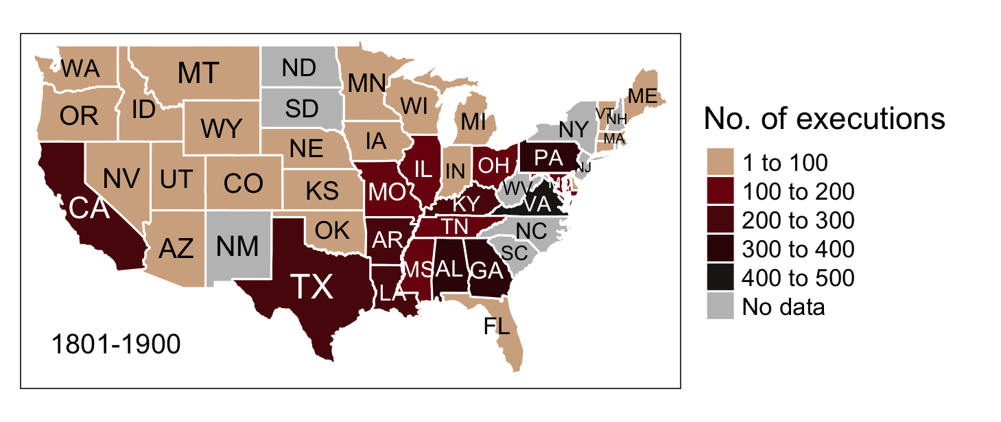
The following choropleth map, which depicts the US states shaded in relation to the number of executions, was created with tmap.
Note that no data could either mean that there is no data available or there actually were no executions carried out during the considered period. See deathpenaltyusa.org for more information on which years the raw data for each state covers.
# Count deaths by state
deaths_sum <- death_penalty_df %>% count(state)

# First letter to uppercase for joining
deaths_sum$state <- gsub("^(\\w)(\\w+)", "\\U\\1\\L\\2", deaths_sum$state, perl = TRUE)

# Left_join data by state
US_shp_cropped@data <- left_join(US_shp_cropped@data, deaths_sum, by = c("NAME" = "state"))

# Set color palette
## Source: http://www.colourlovers.com/palette/170249/Vampyrism
pal <- c("#D3AF8E", "#7A0E0E", "#5A0B0B", "#380606", "#201B1B")

# Map number of executions in each state
map <- tm_shape(US_shp_cropped) +
  tm_fill(col = "n", palette = pal, auto.palette.mapping = FALSE, breaks = c(1, 100, 200, 300, 400, 500),
          textNA = "No data", title = "No. of executions", text.size = "AREA", style = "fixed") +
  tm_text("STUSPS", size = "AREA", root = 4) +
  tm_borders(col = "white") +
  tm_credits("1801-1900", size = 0.8, position = c("left", "bottom")) +
  tm_legend(legend.outside = TRUE, position = c("right", "center")) #+
map

save_tmap(map, "Executions_1801-1900.png", width = 1460, height = 615)
Mapping executions with geogrid
With the geogrid package you can go one step further and turn spatial polygons into hexagonal (or regular, for that matter) grids in two steps: 1. Generate the grid with calculate_grid(). 2. Use an algorithm to efficiently calculate the assignments from the original geography to the new geography.
For demonstrations purposes, the following code snippet is adapted from Joseph’s sample code.
# Calculate hexagonal grid
new_cells_hex <- calculate_grid(shape = US_shp_cropped, grid_type = "hexagonal", seed = 1)
result_hex <- assign_polygons(US_shp_cropped, new_cells_hex)

# Function for tidying SpatialPolygonsDataFrame
clean <- function(shape) {
  shape@data$id = rownames(shape@data)
  shape.points = fortify(shape, region="id")
  shape.df = merge(shape.points, shape@data, by="id")
}

result_hex_df <- clean(result_hex)

# Hexagon plot
ggplot(result_hex_df) +
  geom_polygon(aes(x = long, y = lat, fill = n, group = group), color = "white") +
  geom_text(aes(V1, V2, label = STUSPS), size = 5, color = "white") +
  scale_fill_gradientn(colours = pal, name = "No. of executions,\n1801-1900") +
  theme_void() + theme(legend.position = "right") +
  coord_equal()

ggsave("Executions_1801-1900_hex.png", width = 15, height = 6, units = "in", dpi = 100)
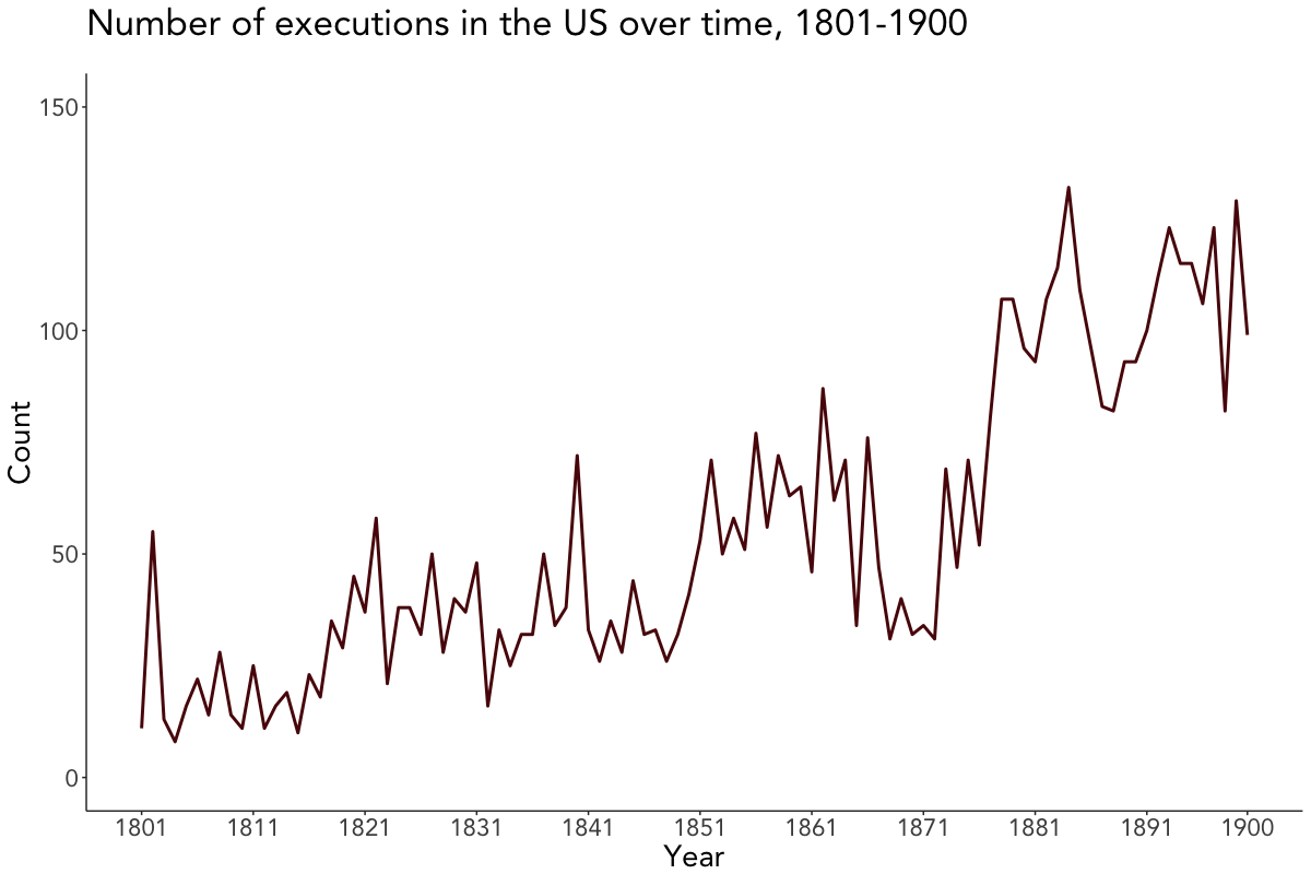
Visualizing executions over time
The number of executions over time were plotted using geom_line() from ggplot2. I manually generated the breaks on the x-axis as I wanted the line to end in 1900, with the breaks being formed once every 10 years (except for the last one).
# Set theme for visualizations
viz_theme <- theme(
  strip.background = element_rect(colour = "grey20", fill = "#92a1a9"),
  axis.line = element_line(colour = "grey20"),
  panel.grid.major = element_blank(),
  panel.grid.minor = element_blank(),
  panel.border = element_blank(),
  panel.background = element_blank(),
  strip.text = element_text(size = rel(1), face = "bold"),
  plot.caption = element_text(colour = "#4e5975"),
  text = element_text(family = "Avenir"))

# Count executions by year
death_penalty_ts <- death_penalty_df %>% count(year)

# Add 01-01 to year due to missing values in month/day
death_penalty_ts$year <- as.Date(paste0(death_penalty_ts$year, '-01-01'))

# Set 10 year breaks and manually add 1900
breaks <- death_penalty_ts$year[seq(1, length(death_penalty_ts$year), 10)]
breaks <- append(breaks, as.Date("1900-01-01"))

# Plot timeline
ggplot(death_penalty_ts, aes(year, n)) +
  geom_line(col = "#380606", size = 1) +
  scale_x_date(breaks = breaks, date_labels = "%Y") +
  labs(x = "Year", y = "Count", title = "Number of executions in the US over time, 1801-1900", subtitle = " ") +
  theme(text = element_text(size = 20)) +
  viz_theme + ylim(0, 150)

ggsave("plot.png", width = 12, height = 8, units = "in", dpi = 100)
Visualizing executions by attributes
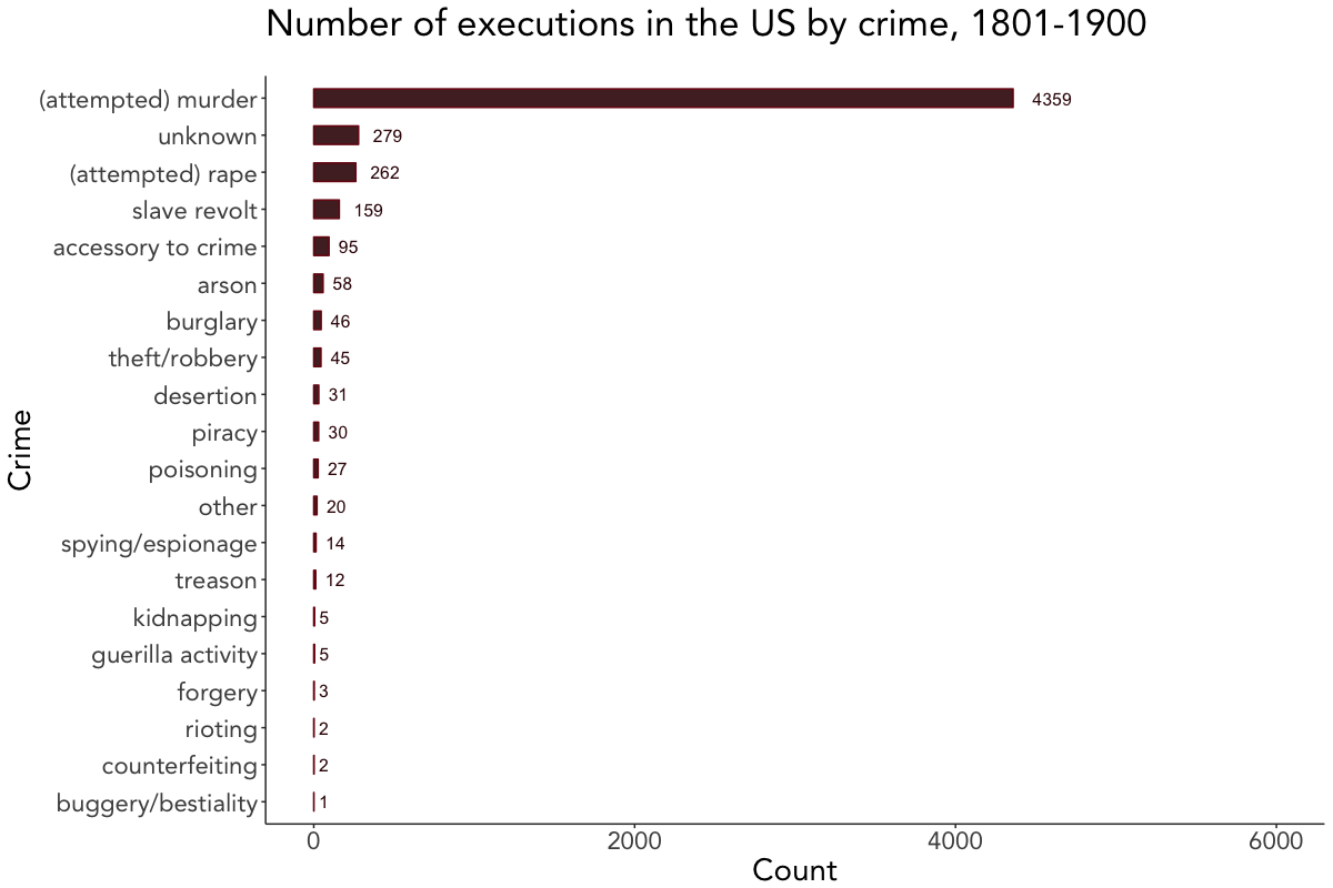
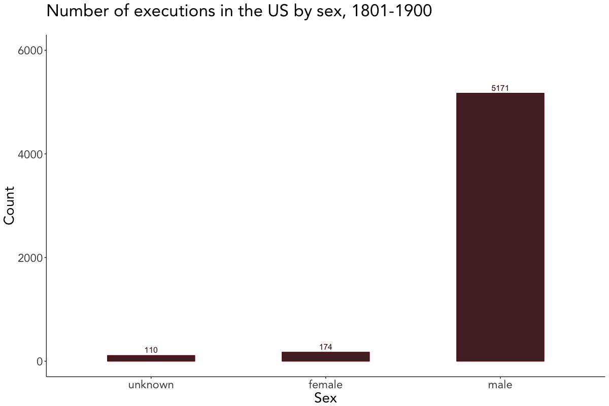
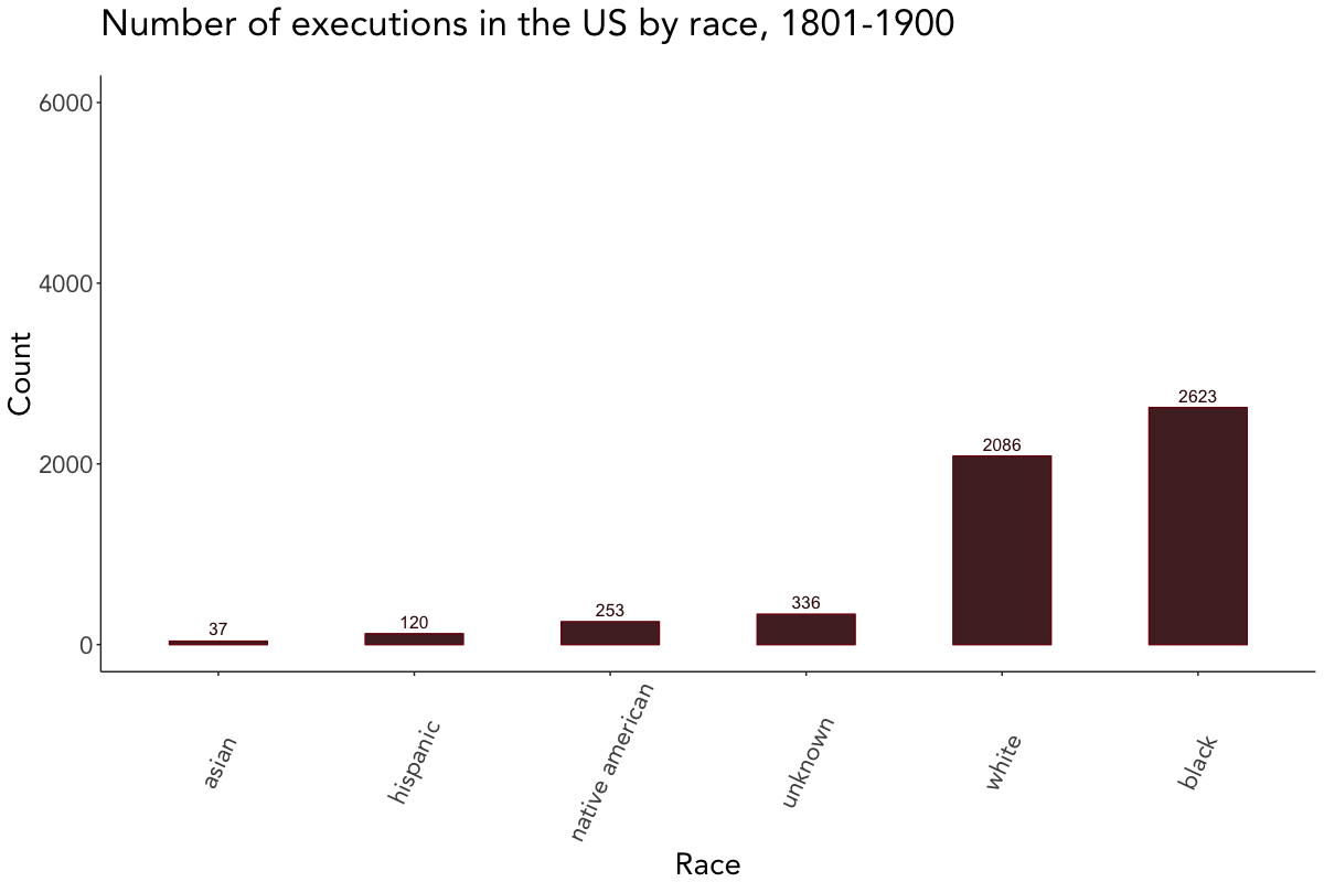
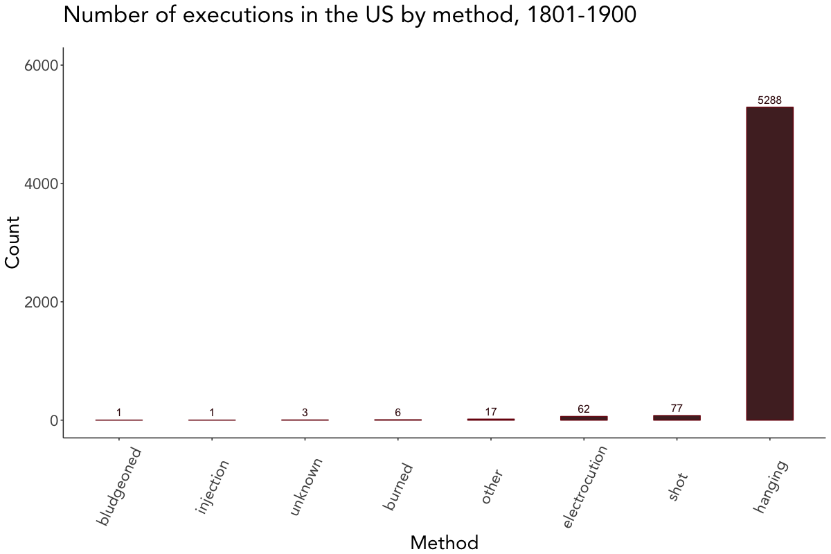
The last couple of plots depict the number of executions by crime, sex, race, and method. Since they’re quite self-explanatory, I won’t go further into the details here and leave you alone with them.
# Plot executions by crime
death_penalty_df %>%
  count(crime, sort = TRUE) %>%
  mutate(crime = reorder(crime, n)) %>%
  ggplot(aes(crime, n, label = n)) +
  geom_bar(stat = "identity", fill = "#380606", col = "#7A0E0E", width = 0.5, alpha = 0.9) +
  geom_text(color = "#380606", hjust = -0.5, size = 4) +
  theme(text = element_text(size = 20)) +
  labs(x = "Crime", y = "Count", title = "Number of executions in the US by crime, 1801-1900", subtitle = " ") +
  viz_theme + ylim(0, 6000) + coord_flip()

# Plot executions by sex
death_penalty_df %>%
  count(sex, sort = TRUE) %>%
  mutate(sex = reorder(sex, n)) %>%
  ggplot(aes(sex, n, label = n)) +
  geom_bar(stat = "identity", fill = "#380606", col = "#7A0E0E", width = 0.5, alpha = 0.9) +
  geom_text(color = "#380606", vjust = -0.5, size = 4) +
  labs(x = "Sex", y = "Count", title = "Number of executions in the US by sex, 1801-1900", subtitle = " ") +
  viz_theme + ylim(0, 6000)

# Plot executions by race
death_penalty_df %>%
  count(race, sort = TRUE) %>%
  mutate(race = reorder(race, n)) %>%
  ggplot(aes(race, n, label = n)) +
  geom_bar(stat = "identity", fill = "#380606", col = "#7A0E0E", width = 0.5, alpha = 0.9) +
  geom_text(color = "#380606", vjust = -0.5, size = 4) +
  labs(x = "Race", y = "Count", title = "Number of executions in the US by race, 1801-1900", subtitle = " ") +
  viz_theme + ylim(0, 6000) + theme(axis.text.x = element_text(angle = 65, vjust = 0.5))

# Plot executions by method
death_penalty_df %>%
  count(method, sort = TRUE) %>%
  mutate(method = reorder(method, n)) %>%
  ggplot(aes(method, n, label = n)) +
  geom_bar(stat = "identity", fill = "#380606", col = "#7A0E0E", width = 0.5, alpha = 0.9) +
  geom_text(color = "#380606", vjust = -0.5, size = 4) +
  labs(x = "Method", y = "Count", title = "Number of executions in the US by method, 1801-1900", subtitle = " ") +
  viz_theme + ylim(0, 6000) + theme(axis.text.x = element_text(angle = 65, vjust = 0.5))